Fonts come in two basic varieties: serif and sans serif. Usually, they look best when there's a bit of contrast, so pairing a serif font with a sans serif font is a good way to start your design.
Take a look at some examples of serif and sans serif fonts using the links below:
Check out this short clip which gives a few tips on design with fonts:

Wednesday, September 27, 2017
Tuesday, September 19, 2017
The five elements of a great layout
An eye-catching layout is the key to a well-designed piece! Take a look at this clip to get the hang of it...
Think about these 5 concepts when you get started with your layout:
Think about these 5 concepts when you get started with your layout:
- Proximity
- White space
- Alignment
- Contrast
- Repetition
You will also need to think about whether you have large or small MARGINS, if you CENTER, LEFT JUSTIFY or RIGHT JUSTIFY your type.
Tuesday, September 12, 2017
Welcome to Beginning Graphic Design - Fall 2017!
Welcome to all new students and also to those of you who are returning! In this class, we are going to learn to see the world through the eyes of a graphic designer. Many of you are probably thinking "What exactly does a graphic designer do?" Here is a short clip which answers that question; let's watch it and discuss!
Two really famous designers you should know about are Milton Glaser, who designed the I LOVE NY logo, and Massimo Vignelli, who designed the signage for the NY City subway system:
 |
| NYC Subway signage by Massimo Vignelli |
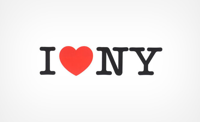 |
| The I LOVE NY logo by Milton Glaser |
Subscribe to:
Posts (Atom)